Saturday

Website Development

I purchased my domain name under www.poleception.co.uk so it's officially mine!

I have been using Muse

In terms of my website progress I have made a banner which is the same on each page that you click on from the home page, it keeps the website all together with the logo. I also decided what headers (pages) I wanted to include on the website taking into account other fitness and beauty websites I had looked at. I decided I liked the colour scheme of the purple from the pole dancing shoot, its feminine and works well with the layout and my images.


I knew I needed some catchy fitness slogans that stood out to the audience!

'THE NEW FITNESS PHENOMENON'
'EXERCISE YOUR MIND AND BODY WITH A NEW CHALLENGE TODAY!'


I have also used colour schemes from my other images such as the sportsweat shoot to match logos and text boxes.

Pole Dancing Shoot

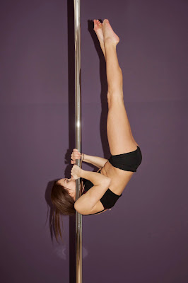
I did a Pole dancing shoot in Portsmouth.The difficulty was knowing that shooting in a dance studio meant that we couldn't control the lighting and we were using mostly natural light that was available. We were lucky in that there were many windows letting in natural light so we did have more control than expected using black out blinds to adjust. This did take up a lot of time before we could shoot but it was necessary. There were also blinds that acted as the backdrop for the images that covered  the mirrors. The model was a very talented Pole Dancer and held a variety of strong positions.As my project is focusing on the fitness aspect, I need to make sure this is clear in the photographs by showing her strength. I also had to consider that she will be advertising my business so I needed some shots of her looking happy and smiling. The makeup and hair was natural, I also had to cover bruises she has on her legs and body to make it easier in the retouching process.


The images have been retouched. I used Photoshop to close up any gaps that were exposing the mirrors to keep the background all purple. I am happy with the final images and I think they will work well on my website and brochure.

logo/ branding

The first step to the design part of my project is to pin point the branding and logo for the business.


I experimented on InDesign and here are some of the logo's I came up with. I know I want to call the business "Poleception" (Fitness & Beauty) as it plays on this idea of the perception of Pole dancing which I am trying to change. I was mostly getting a feel for how to create logo's using various different shapes to play around with the letters, these logo's feel too confusing and busy i want something much more simple and effective.


FINAL LOGO


My final logo I came up with is simple but effectively shows what the business is.I can now start putting layouts together and using the logo on my images.

More photos


I had some spare time in the studio and did a beauty test shoot but the images are not what I wanted to achieve. The model has a great  face for representing the beauty salon part of my business but it is key the images look professional and the lighting is not complimentary.

Hair beauty Shoot


Inspiration


For the beauty section of the brochure I knew I wanted am image similar to the one above to be spread across the whole page of the beauty section. I had to consider capturing space in the photographs so I would have room for text or logo's on my website and brochure.

Final Images - Retouched


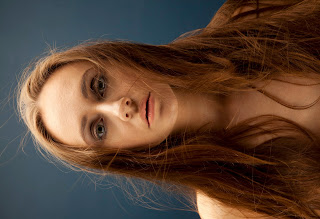
I also wanted some portrait close up style images.


The shoot was very successful, the production values are high as the photography lighting and makeup all work well together. The dark blue background worked well with the neutral colours of the skin and hair. Using a reflector helped to give a glowing beauty look. It was challenging getting the hair to go where I wanted using two fans and good timing from the photographer. The lighting set up included an octobox from above which gave it a soft effect. I would insist on using this set up again for similar beauty looks. The model was also very understanding of what exactly we wanted to achieve and she did her best to help.

Tuesday

Sportswear Shoot

hm-four

I am collaborating with a photographer for a sportswear shoot.
The hair and makeup is very minimal but I will use baby oil to create the 'sweaty look'. This is the first test shoot to help give me an idea of exactly what images I want for the final outcome.


Still Life 'Fitness' Photographs from shoot.

These images can be used on the Instagram page.


Behind the scenes


Images from the shoot


Reflective Evaluation

The images weren't as successful as I had hoped. The model had never modeled before so she felt a little uncomfortable and that shows in some of the photographs although she gains more confidence as the shoot goes on. The quality of the pictures themselves are grainy and not all in focus. The lighting was also not accurate in achieving the right kind of setting. The background should of been white rather than grey. Next time I will ask the model to smile more to give off the feeling of fun that I am trying to promote.

Although it was only the first test shoot for the project I now know what needs to happen next time. I will look for other photographers who want to collaborate with more experience with this type of set up but I don't want this to take up too much time. There are some positives that have come out of the shoot such as the baby oil effect on the skin which worked well to give a sweaty sheen to the skin and the natural makeup and hair was appropriate for the sporty look.